Big data is growing every day. It is the challenge of the decade for many rental companies. One way to make sure your company is ready is by choosing a solution with a great visual interface. Data visualization makes it easier to see all important processes in one glance. This way, the huge piles of data are compiled and presented in an effective and efficient way. It is easy to consume and create reports.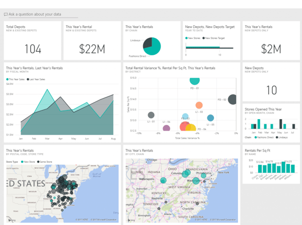
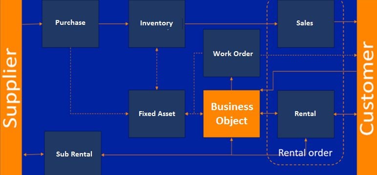
Image 1: Example of data visualization: BI Cockpit overview
Why is data visualization important?
The fact is, our brains are not made to analyze enormous sets of data. Our short-term memory has its limits. This is where data visualization comes in: it allows the viewer to make quick analyses of how an issue in one area can impact the larger process. This can save time and money and creates agility.
The quicker your company collects, processes, and analyzes data, the greater the advantage over your competition will be. It also leads to happy employees. Employees who enjoy writing reports can generate them better and more insightful. Even employees who dislike writing reports can make them more quickly and easily. So, if you are looking for a new system for your rental company, look for one with a great visual interface as well.
Image 2: When visuals are designed consistently, everything seems to fit together
Four things that build a great visual interface specifically for equipment rental and service companies
So how do you know if the rental system you desire has the perfect visual interface? Below, we will provide a few tips how on to recognize whether a visual interface will be an asset to your rental company.
-
Positioning People are very intuitive.
For example, if you were taught to read from left to right and top to bottom, you will also read like this on the computer: your eyes are drawn to the upper left corner of the screen. So, you need to place the most important information here. This is also important for buttons and information. It might look prettier to place a button on the bottom right, but what if it takes users an extra minute to find it? Are you sure you want to pay the price for putting the button in a beautiful but illogical place?
-
Consistency
When visuals are designed consistently, everything seems to fit together. This will create harmony in the overall look and feel of the system. When a system looks chaotic and disorganized, it can even create distrust in the system. But if forms, for example, are consistent, usability improves. Employees learn how to use them more quickly, and it saves them time and energy.
-
Simplicity
Of course, you can put every little detail on the dashboard, but this will not improve the workflow. It is much more efficient to group related elements together and keep the interface clean and simple. When you group elements logically and according to function or relationship, the system feels intuitive and easy to use.
-
Form follows function
After reading our previous points, this seems quite logical. But sometimes this means subtle differences. We can understand this better if we take a look at the use of color. For example, you may love the idea of two buttons that are slightly different in color. But did you know that 8% of men are color-blind? So, it is very possible that some of your employees cannot see the difference in these two colors. This is why it is imperative to use contrasting colors, even if this might look less attractive. The reason behind the form is always more important than how beautiful a system looks. Make sure you choose a system that prioritizes function above form
Are you curious how To-Increase plays a proactive role to help customers handeling big data? Please contact to discuss at info@to-increase.com