
While the booming data science market is no news, just having clean, up-to-date, and organized data is not enough to carry out efficient analysis for organizations. Why is that you ask? Because the clean and transformed data needs to be usable and presentable too. This is where data visualization comes in.
Visualizing data makes it easier to understand and is more action-oriented than consolidated tables, which tend to be more confusing and difficult to read, besides taking up a lot of time and effort. According to Allied Market Research, the current data visualization market stands at over $8 billion and is estimated to grow to approximately $20 billion by 2031. The numbers clearly show promise, and it is a bandwagon to jump on.
To-Increase offers no-code, easy-to-use, end-to-end analytics solutions for Microsoft Dynamics 365 Finance and Supply Chain Management (F&SCM), right from data preparation to visualizations, where data can be translated into information with Power BI built on top, offering a quick start for users.
In this blog, we touch upon what data visualization is and why organizations need to incorporate it to ace their analytics and business intelligence (BI) efforts.
What is data visualization?
So, what is data visualization? To put it in simple terms, it is nothing but the way your data is represented graphically or in a visual format (for instance: charts, graphs, reports, etc.). Data is complicated, and to drive value out of it, we need to visualize it. Otherwise, it might be challenging to communicate any insights, patterns, or findings within the vast number of datasets available. Hence, visualization is crucial to interact with the data and ensure we pull the right insights.
Moreover, it helps to keep the information relevant and gives access to the right kind of data and what it means in a visual context. This makes the data more natural to our human minds, as we are more inclined to consume visual content than complicated numbers and tables. The displays are typically descriptive, easy to understand, and are simple summaries that can be used for analysis pursuits. With the main goal of interpreting the information, cleaned and transformed data can be used, depending on the purpose.
The process of data visualization is carried out with the help of data visualization tools which provide an easy and accessible way for users to see and understand data patterns, trends, and outliers, if any. It enables you to view, interact, and better understand data, whether simple or complex. The correct visualization, thus, keeps everyone on the same page, regardless of their level or expertise.
Why is data visualization important?
It is not always easy to understand the data in front of us. With the help of data visualization tools, we can analyze large amounts of data and have it in the form of information that is easy to consume to help us make data-driven decisions. More technically, it is also important for exploratory data analysis and data mining so that analysts and data science team players can familiarize themselves with the data and its structure to ensure quality.
Considering that we are focusing on Dynamics 365 F&SCM, the data we receive from it is primarily unsuitable for reporting, is transactional, and hard to comprehend. Therefore, transforming it into visual forms, such as reports, dashboards, and others, means you can easily understand it. So, the better you can put across your points visually, in whichever form, the better you can leverage the information.
Here are some additional reasons why data visualization is a crucial aspect of analytics and BI:
- Allows large amounts of data to be viewed in a better way at a glance and resolves any inefficiencies, allowing it to showcase the visual impact data has on a business, both to internal and external audiences
- Makes it easier to find a relationship between various elements or situations in a business, encouraging the users to identify concerns or what’s working in their business. This, in turn, helps to prepare them for the better
- Access to the right kind of information in real-time, which can help in assisting management functions and business operations
- Acts as a bridge between visual storytelling and analysis of the who, what, where, and how of data - empowering a data-driven culture in the organization
- Helps you get a clear picture of the opportunities in the market by displaying data such as value and risk metrics, among others, through various charts and graphs.
How can we leverage new-age data visualization tools?
When looking for a data visualization tool, choosing one with all the features needed to address your organization's needs is vital. Microsoft’s Power BI is a good example of a self-service business intelligence tool that empowers you to collect, analyze, visualize, and share data. It has versatile data visualization capabilities to help you with powerful business insights.
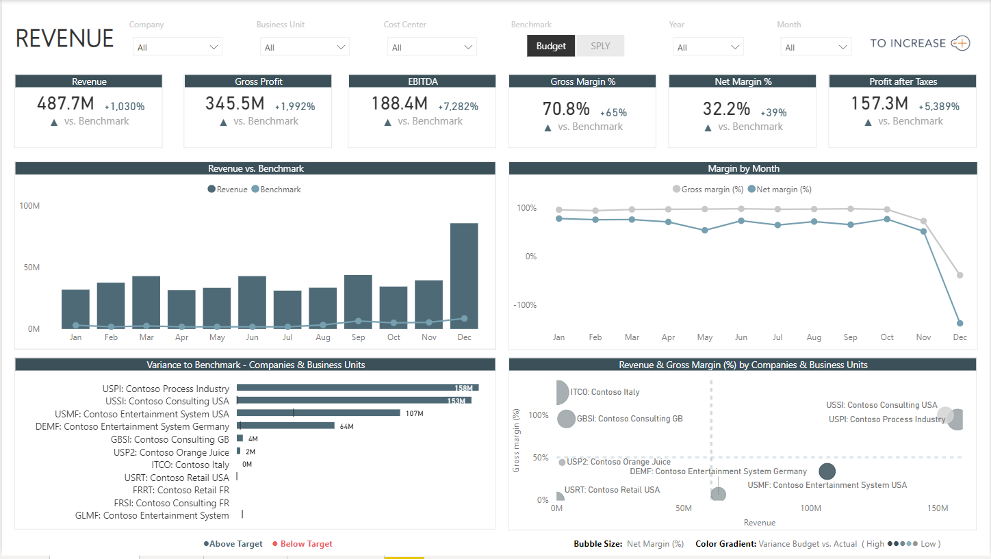
A Sample Revenue Report Generated through Business Analytics Suite
Power BI can give you a real-time 360-degree view of your business, making it easier to make effective data-driven decisions. With an interface that’s similar to Microsoft Excel, the tool does not need any technical expertise. Also, it is a no-code solution, which means it's easy for end users to set up, without a developer's help.
Here are a few advantages of using Microsoft Power BI’s data visualization capabilities. It can:
- Transform data into interactive visuals
- Create real-time dashboards to empower better business decisions
- Spot patterns and trends that you wouldn’t normally notice if you were looking at numbers on your own
- Display data changes over time in a visual format
If you are looking to invest in analytics that takes care of all the aspects from start to end, then you could consider our Business Analytics Suite. The solution is thoughtfully and explicitly built for your industry and comes pre-packaged with metrics that will help take your business to the next level. With an easy to use, plug-and-play approach, anyone in the organization can use it with less or no technical know-how.
Have any queries? Our experts are always ready to help.
For more information on our Business Analytics Suite for Dynamics 365, here is a video that gives an overview of how you can leverage the solution in your organization.


